EXAMINING NYC TRANSPORTATION DATA THROUGH MAGPIE’S ONE-CLICK RAPID DATA PROFILING
In our first data-centric blog post, we provide a step-by-step introduction to the immediate value generated by Magpie’s ability to show users what is in a dataset before analysis begins. Below, we use publicly available data from New York City’s Open Data Initiative as our sample data set, and we’ll uncover obvious patterns.
THE POWER OF DATA PROFILING: ANALYTICS BEFORE ANALYSIS
This blog post is a follow-up on our March 20th, 2019 posting: “Supercharging your data exploration with Silectis Magpie”. In this post, we will dig into one of the many time-saving capabilities that we built into Magpie. Specifically, this post will focus on Magpie’s ability to run a quick profile on a data set and display a visual overview of the contents of a data set so a user can understand and make assessments about a data set before the analytics stage. Once you have identified a table of interest, we were able to profile a table to identify primary keys, understand which fields were used, browse distributions of timestamps fields, and look at how data is distributed across categorical fields, all with Magpie’s simple profile table command. In the case of the New York City (NYC) taxi data, a tremendous amount of information is uncovered by profiling the data: running single line of code in Magpie. And in the end, we will have created a window into the differences between how New Yorkers use both Uber and yellow cabs… before we need to do any substantial analysis of the data.
THE DATA
NYC’s Taxi and Limousine Commission (TLC) has made a huge collection of “Trip Record Data” available to the public through NYC’s Open Data initiative. This data goes back to 2009, and includes trip data from a variety of sources, including the standard “yellow cab” and “for hire” vehicles, which in today’s NYC are primarily Ubers (and Lyfts). The data is in a .csv format and is broken into 36 different files per each calendar year. The data is created by trip record submissions made by the various entities regulated by the TLC. The information contains multiple fields, but for the purposes of this demonstration, we will focus on pickup time for a year’s worth of data spanning 2017 and 2018.
THE PROFILE
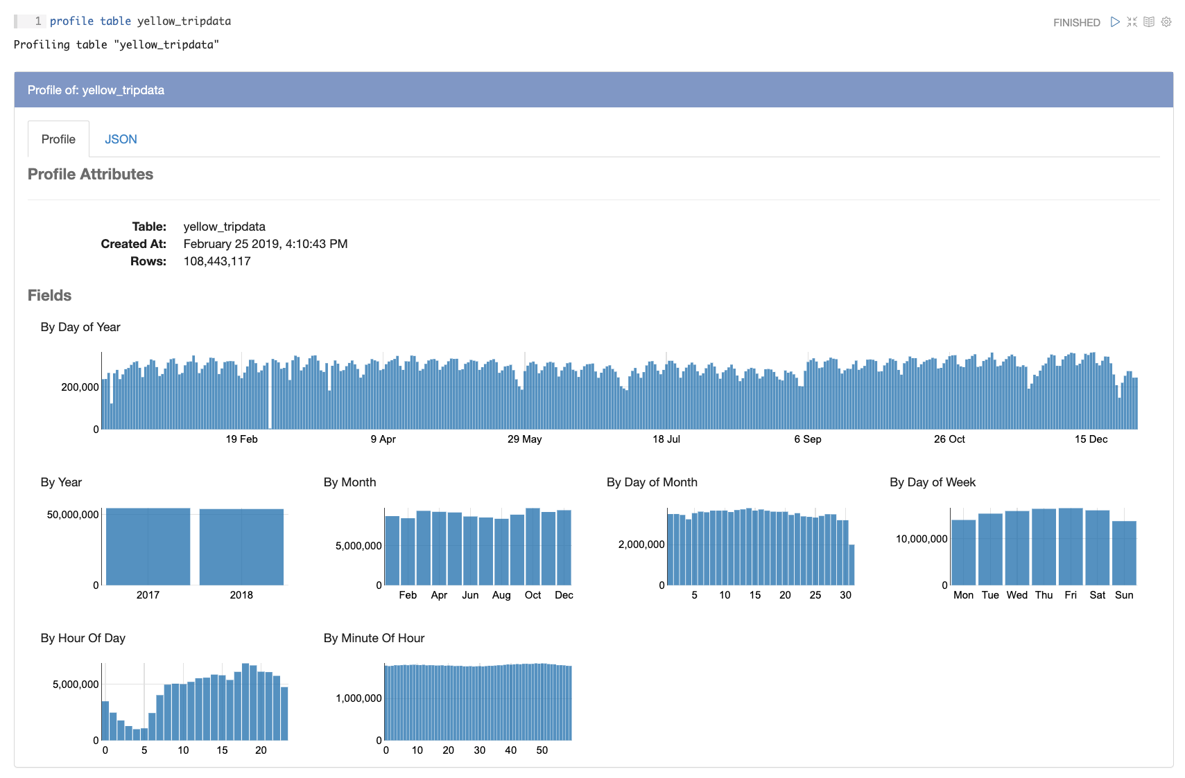
Magpie is designed to do as much work as possible to prep data for analytics. We at Silectis believe there is a gap in the industry and too much time is being spent by analysts on work outside the scope of analytics: prepping and organizing data so that analytics can begin. We’ve packed Magpie with features that should dramatically chip away at this “pre-analytics” work. One of the strongest features of our platform is the ability to profile a table. Here is a snapshot of the result of a profile run on the yellow cab “trip pickup time and date” table inside the NYC TLC Trip Record data:
And here is a profile of the “trip pickup time and date” table inside the NYC TLC Trip Record data, yet this is of “for hire vehicles” (Ubers, Lyfts, limos, etc):
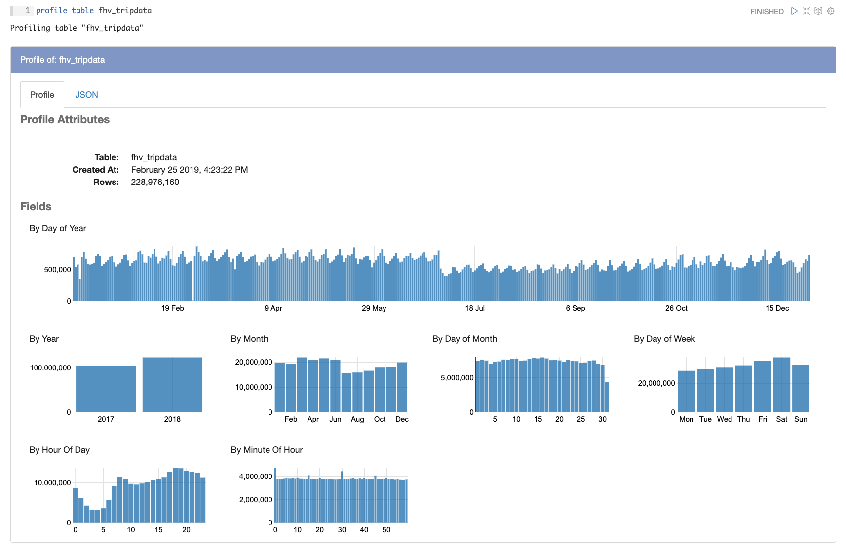
Immediately, there is a lot of information to be observed and gained about the data itself. First off, a user can eyeball the data to make sure everything seems to make sense. While a basic step and obvious statement, this can save hours of misplaced analysis if a user can see data anomalies or data corruption at this point in the process. Without our profile ability at this stage, a user could spend a large chunk of time browsing through the data to make sure the info matches with how one would expect taxi trip data to look. So, moving on past that first step, Magpie starts to point us in the direction of some interesting trends that are ripe for analysis and comparison. This posting isn’t going to carry on into the other fields beyond the “trip pickup” tables, however Magpie’s profile command shines light on the entire data set.
THE DIFFERENCE IN USAGE BETWEEN UBERS AND CABS
The headline of this blog declared that Ubers are favored when it is time to go out at night, and yellow cabs are favored when going to meetings during the day. And a close look at the visualizations in the profile of pickup time day of week for each gives this away:
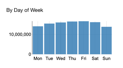
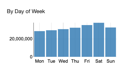
In these two charts, automatically created by Magpie’s profile ability, we see a stark difference in cab and Uber usage by day of week. Cab usage correlates strongly with the work week, with usage growing steadily to a peak on Fridays, the Uber data has a strong peak on Fridays and Saturdays. This fits our initial hypothesis that cabs are more for use during the work week, and Ubers are favored on weekend nights. Digging a step deeper, Magpie also profiled the hour of day of the trip start data for both:
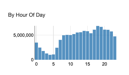
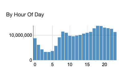
These charts show interesting trends of usage during the day. Clearly there is a focus on Ubers and cabs in the morning rush hours, and clearly there is a usage peak for both cabs and Ubers in the afternoon and early evening rush hours. However, there is a clear bias in the cab data with a focus on usage during the day, when there is demand as New Yorkers rush from meeting to meeting in the middle of the day. There is also a less of a drop-off in Uber usage after the afternoon rush hour, suggesting New Yorker do favor Ubers as they go out for the night.
ALL THESE CONCLUSIONS… CAME BEFORE ANALYSIS
This has been just a small glimpse into the powerful abilities of Magpie to profile data and show what is inside a data set and potentially even allow a user to draw conclusions before even beginning traditional analysis. The NYC TLC data is a rich data set, and it will offer multiple avenues for analysis into how and when and why New Yorkers ride around in cars during the day, that could be a lot of analysis for a team of analysts. However, with just a few lines of code, and the power of Silectis’s Magpie platform, we have supercharged the ability of an analyst to explore data before analysis.
To learn more about how Magpie can supercharge your data exploration, sign up for a demo.
